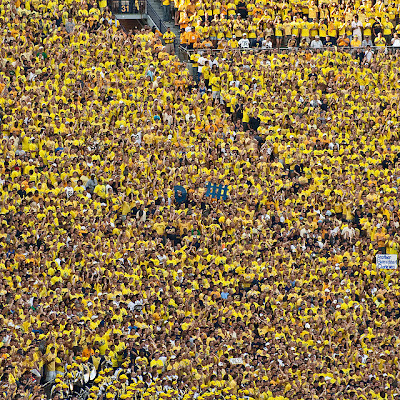
We'll get to why the phrase "maize out" irks me to no end in just a minute. But for now, realize that what you're seeing in this picture is about 3000 college kids wearing yellow t-shirts. This is a "yellow out".
Yellow is not maize.
At a certain point, it all becomes semantics – and we may already be at that point. But, what YOU define as the proper shade of maize, or yellow in this case, can be worlds apart from what I would consider maize. At least the proper shade that Michigan sports teams aught to be wearing.
I am not the only one discussing this in the Michigan blog world. Brian from mgoblog has it on good authority that there is an effort within the athletic department to slowly get away from using the bright neon-yellow that has become synonymous with Michigan sports teams.
A point to which I can only add a slow clap.
Hit the jump for more.
Either by design or simply through natural evolution via Nike and more recently Adidas, who really went nuts with the yellowing of Michigan's maize – either way, the color has undergone a transformation throughout the years that, finally, seems to have reached a critical mass. And the critical mass was likely the legacy jerseys worn against the Irish on Sept 10.
It wasn't so much the color itself, I think it was just the amount of it on the uniform. I won't call it "shock and awe", but perhaps I just did. The 45 on the helmet is much more maize than the circus stripes on the shoulder. This was by design. The numbers on the helmet were meant to reflect the past when Michigan's shade of maize was considerably darker.
Perhaps this was Brady Hoke or Jon Falk's way of telling the athletic department that this yellowing of the maize needs to stop. Either way, people noticed and commented on it.
MVictors dove head first into this topic last summer. The main issue was quickly derailed by talk of varied types of photo processing, color temperatures, and how old photos degrade over time. Those are all worthy culprits of varied shades of maize. Take these two photos for example of old Jimmy Harbaugh taken from the same game:
| A proper away jersey. Look at those classic arm stripes. Love 'em! |
This photo was taken with my iPhone from my seat (B54) in the pressbox, in a mix of florescent and natural daylight. You can not deny that this color reflects the more defined Pantone color Michigan still lists as it's official color – Maize 116.
We could go round and round about which shade of maize is better looking, that's just personal taste. But you should know that I am right and you are wrong. I jest. Just look at the maize used on this site. I'm just as much to blame.
In looking at old photos, it seems as if Michigan's maize used to be almost orange compared to what Adidas has given us in recent years. But I can't say that I ever thought to myself at the time that Michigan's colors were orange and blue. I think old photos just look old, and when they degrade, they can take the colors with them. Even old photo's of Michigan's blue can look weird.
I am on-board with the effort to move away from the crazy neon-yellow. I'm sure it will take time and it will be subtle. But I'm all for it.
And to get back to why the phrase "maize out" drives me crazy...Michigan just can't seem to do it right. Michigan calls for a "maize out" and this is what we get...
The infamous "scarlet out" from 09. Oh yeah, it was that bad.
The simple fact is that no one owns a maize jacket. It sorta works if it's 75 degrees and we're playing Notre Dame. But not when it's 45 in November. Dave Brandon knows this, thus the "maize" pom-poms at this year's Ohio game. But even inside Crisler, Michigan fans just aren't interested in wearing maize.
The "maize out" experiment should be over. It just doesn't work here.


No comments
Post a Comment